Delta E 101
Introduction
How do you put a number to perceived difference in color?
No doubt a fun question to think about, but a more serious topic for print and textile business that require color consistency.
The International Commission on Illumination (CIE) formed in the early 1900s to standardize the fields of colorimetry, photometry, and imaging. The commission addressed the topic of color difference in 1976, introducing the world to the concept of Delta E.
In this guide we will take a look at three of the Delta E algorithms produced: dE76, dE94, and dE00.
Defining Delta E
ΔE - (Delta E, dE) The measure of change in visual perception of two given colors.
Delta E is a metric for understanding how the human eye perceives color difference. The term delta comes from mathematics, meaning change in a variable or function. The suffix E references the German word Empfindung, which broadly means sensation.
On a typical scale, the Delta E value will range from 0 to 100.
| Delta E | Perception |
|---|---|
| <= 1.0 | Not perceptible by human eyes. |
| 1 - 2 | Perceptible through close observation. |
| 2 - 10 | Perceptible at a glance. |
| 11 - 49 | Colors are more similar than opposite |
| 100 | Colors are exact opposite |
Take the table as a general guide; it’s possible to get a Delta E value below 1.0 for two colors that appear different. This is the case with CIE76 and CIE94 formulas, in which saturation is either not considered or not weighted properly.
The table above is built from the author's own tests and does not come from an authority source. Do your own testing to determine threshold for your use case.
Because of inconsistencies between the three algorithms, the exact meaning of Delta E changes slightly depending on which formula is used. Think of Delta E less as a definitive answer, and instead a helpful metric to apply to a specific use case.
Delta E 76
If you were asked to write a formula to quantify perceived color difference, how would you do it?
One logical approach would be find a color matrix that is grouped on perceived color, and very simply measuring the distance between the two points in 3D space. Only one problem stands in your way: before 1976, this color space didn't exist!
CIE gave two gifts in 1976: the CIELAB color space, and the first Delta E formula.

Look familiar? Indeed, you're looking at a ripoff of the Euclidean Distance formula. This makes sense, as CIELAB color space was created as a 3D matrix of color points. Directly measuring distance should work, right?
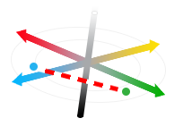
Alas, issues are afoot. The premise that LAB color space is perfect in perceptual uniformity falls short, particularly with differences in saturation. The example above demonstrates that for hues in the same lightness it works well. But what happens when we have two saturated colors of different hues?
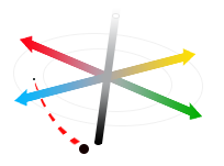

...indeed - they appear to be!
The two above blocks represent the dark blue and dark red as graphed. CIE76 reports this difference as ΔE 10 (perceptible at a glance), when by definition difference should fall in the ΔE~1-3 range (perceptible with close observation).
Clearly saturation is a major problem for dE76. In the below example, blue highlights pixels that each algorithm has determined as 25% within tolerance of pure saturation (black).
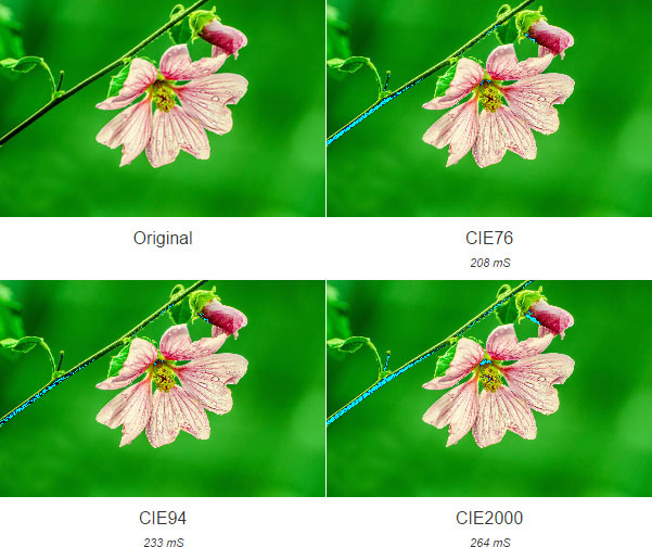
Delta E can mean different things for a given use case. Here, if we wanted to come closer to matching all black color in CIE76, we would pad the Delta E number more. (Note this lends to more error, as tolerance increases.)
So when do we still use CIE76? The formula has the major advantage of being a simple Euclidean Distance calculation: it’s faster than the successive CIE formulas. It’s used in performance-intensive situations that don’t require high accuracy. Image processing and real-time post processing of media is an example of where CIE76 would suffice.
With such an obvious flaw around saturation, CIE continued in the laudable quest for accuracy.
Delta E 94
In 1994, the original Delta E formula was improved. The new formula would take into account certain weighting factors for each lightness, chroma, and hue value. It also introduced the ability to add a modifier according to the use case: either textile, or graphic arts.
Gone are the days of simplicity:
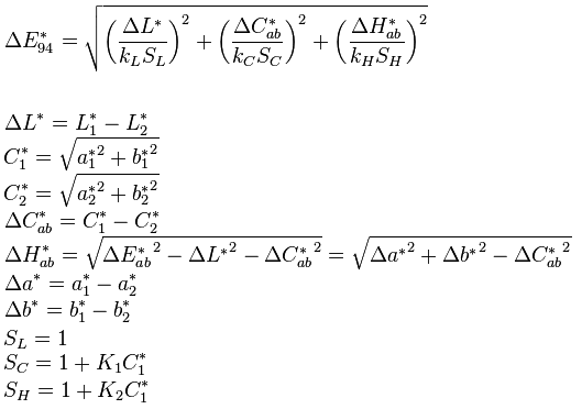
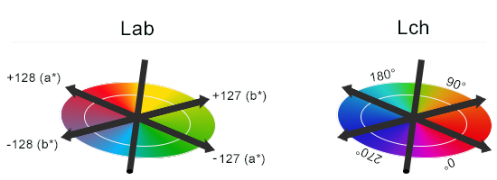
CIE94 introduced a conversion of the given Lab value into CIE L*C*h (Lch). The two color models differ in that Lch represents hue as an angle instead of infinite points of color. This allows us to more easily troubleshoot and perform calculations on hue.
CIE94 surely outshines CIE76, but it’s no gold. The CIE94 still falls short when calculating the perceived lightness of two colors.

Given the two colors above, we can agree that the two are much different in hue, but similar in overall lightness. CIE94 calculates ΔE 128 (polar opposites), while CIE2000 more correctly calculates ΔE 49.4 (middle of the road).
CIE94 is very much Baby Bear in Goldilocks lore: It’s a middle of the road formula where accuracy is necessary but not mission-critical. It’s still often used in textiles and printing applications today.
Delta E 2000
The CIE organization decided to fix the lightness inaccuracies by introducing dE00. It’s currently the most complicated, yet most accurate, CIE color difference algorithm available.
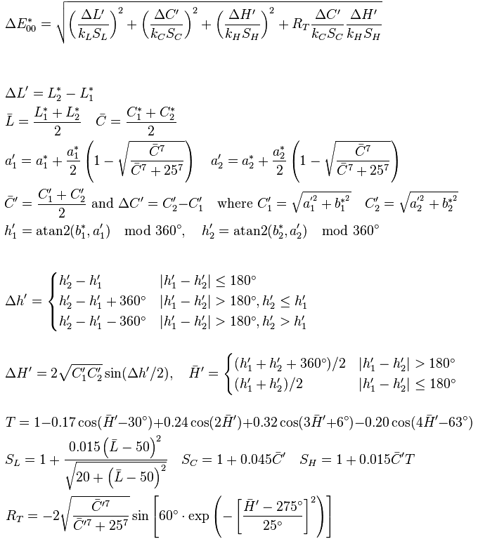
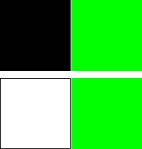
All this busy work gets us a more accurate lightness calculation. We can see the difference in saturation weighting below. This graph compares dE94 and dE00 in posing the question, "Is pure green more similar to white or black?"
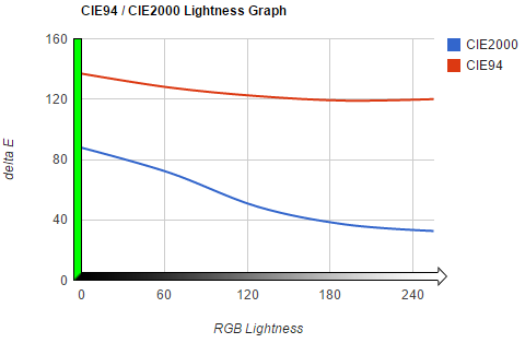
Bravo for dE00, which maintains the correct weighting as lightness fades from black to white. The formula concludes color difference between green/black and green/white is moderate.
dE94 incorrectly concludes that black/green has roughly the same color difference as white/green. It’s almost as if it couldn't weight saturation properly!
Although the most accurate we have today, dE00 is not without fault. The most significant discontinuity occurs when compared hues are 180° from each other (forcing a hue shift in the calculation). According to a Rochester CIE2000 Analysis paper, this could create a discontinuity of ΔE 0.2734. For all but the most high accuracy use cases, this is negligible.
Remember: Delta E accuracy must be confirmed through the very tool it was meant to remove subjectivity from - a pair of human eyes.
References
- (2014). Retrieved from http://www.cie.co.at/
- Sharma, G. (2004). The CIEDE2000 Color-Difference Formula: Implementation Notes, Supplementary Test Data, and Mathematical Observations. Retrieved from http://www.ece.rochester.edu/~gsharma/ciede2000/ciede2000noteCRNA.pdf
- Color Differences & Tolerances: Commercial Color Acceptability. (2013, January 1). Retrieved from http://industrial.datacolor.com/support/wp-content/uploads/2013/01/Color-Differences-Tolerances.pdf
- Brainard, D. (2003). Color Appearance and Color Difference Specification. In The Science of Color (pp. 192 - 213). Elsevier.
Errata
- 11/11/2016 - Fixed caption . Thanks goes to Peter Luft.
- 09/25/2019 - Fixed LAB color space diagram showing incorrect labels for -a/+a . Thanks goes to Andrew and the team at Leatherman